Friday, May 15, 2020

Comparative Indoor Covid-19 Transmission Risks

Ever since the lockdowns started--and before, actually--I've been trying to understand what activities involve the most risk of transmitting Covid-19.  Obviously, when looking to reopen, we have to balance out the economic benefit of a particular activity versus its risk of driving infection rates higher.  We still do not, however, have definitive answers on exactly which activities entail the highest risk.  Each state which introduced measures to control disease spread took a variety of actions, and usually at a very compressed timeline so that it is impossible to definitively say which measures specifically are responsible for how much of the decreased disease transmission that followed.

Unfortunately, this situation is likely to continue given that places that are reopening are also tending to gradually reopen activities across the board in a phased, rather than pick specific targeted activities at specific phases to reopen fully.  So we are again probably going to end up with ambiguous data on what activities are the most useful to curtail.

Crowded, Static, Indoor Settings--Particularly Risky?

My intuition currently is that may be one clear, standout activity type that has the most impact on transmission spread: namely, crowded indoor gatherings.  This is an obvious danger, to be sure, but how much more dangerous this type of activity is than other activities has been frustratingly difficult to quantify.  We have some various studies on respiratory droplet spread among groups, and some studies on the distance the virus might be able to spread via air convection currents in enclosed spaces . . . but not a lot, really.

The best cases I've seen so far that indoor close quarters are the big danger have been made by case studies.  I'm pretty convinced by Dr. Erin Bromage's post on this: https://www.erinbromage.com/post/the-risks-know-them-avoid-them .   I highly recommend reading this blog post in full; he discusses some of the most significant instances of "super spreading" and tries to draw out what each of them have in common.

A Slightly Different Take on the Question

I wanted to add a little bit to this conversation by trying to look at indoor risk in a different way.  I want to compare two indoor activities which might not seem tremendously different at first, and I want to try to roughly quantify the different risk involved in them using imaginative but numerical reconstruction.
This is going to be similar to a type of exercise called a "Fermi Problem" in physics (https://en.wikipedia.org/wiki/Fermi_problem).  The idea is to get to an idea of comparative risk between two different activities, to maybe within an order of magnitude.  I think this is a useful exercise because it can give you a framework for trying to guess at comparative risk, and maybe do better with the guessing than simple intuition.

So here's one situation: imagine you are observing a grocery self-checkout kiosk.  One person is checking out and he coughs.  Five minutes later, he is gone and another person is checking out in the same space.  Another five minutes later, and another person checks out in the same space.  What are the chances that you have observed a transmission of the disease?

Let's answer this question by making up a measure of risk we'll call a "risk factor".  The number will be arbitrary, but we'll pick a baseline: being in the immediate vicinity of an infected person who coughs.  When one person emits infected droplets into a particular space, that space is contaminated and anyone in the immediate vicinity is at a certain risk.  But then time becomes a factor, because the infected droplets instantly begin to fall and to disperse, and so the amount of contamination in that space immediately begins to drop.  So we need to make the risk factor correspondingly drop over time for people who pass through later.

And so the risk for our self-checkout kiosk scenario is going to be the baseline risk--let's call it a 3 for the first five minutes of exposure--but then reduced over time.  We'll guess that after five minutes, the next five minutes would give you a risk factor of 2, and then the next five minutes would be 1, and then zero thereafter.

In the scenario we have just described, the total risk factor for the transmission of the disease is therefore 3 "risk units": 2 for the first person and 1 for the second.  How often would this happen in a day?  Let's guess a hundred times in a single day, which means that the combined risk for a day at the self-checkout kiosks is 300.

Change the Scenario

Now let's take that baseline "cough", and instead think about when it happens during a religious ceremony which lasts one hour.

First, the person who is the source of the cough is no longer merely passing through the space.  So if there was one cough at the self-checkout kiosk at which the person spent 5 minutes, there will now be 12 coughs by that same person over the course of the hour.  

Then, every person who is next to the coughing person will *also* be stuck in place, and thus have immediate exposure--for each cough--for the first five minutes, which we said would count for the full baseline 3 risk units, but then also exposure for the next five minutes, which we said was 2, and also the next five minutes, which we said was 1.  So, 6 risk units total per person, per cough.  

But *furthermore*, rather than just two people total exposed, the contamination occurs inside a sea of people.  There are now at least two people to the right within infection range, and two people to the left, and probably three people in front and a person behind.  Furthermore, given a closed, recirculating air system, the particles can drift all over the place and find a person in any pew to which it drifts.  Easily a dozen people or more could be exposed each time.

And why are we just counting coughing, anyway?  Loud speaking emits just about as many droplets as coughing.  Singing emits *more* droplets.  So what do congregational responses and hymn singing do to the risk factor, remembering that it's not just a few people coughing but everybody, and all at once?  Depends on the type of congregation, but I'd say you should multiply the risk by at least a factor of 10 here, and this is probably an understatement.

So if there are just 12 coughing people in the entire congregation, instead of the 100 we figured for the grocery story, the risk factor is now 12 * 12 * 6 * 12 * 10, which is 103,680. We're at over 300 times more risky for the hour of worship than for a day of checking out groceries.

Conclusion

So what's the conclusion of this kind of guesswork?

First, I'm convinced that this sort of exercise is worth going through when evaluating activities for disease transmission risks.  I think if you asked a random person which activity was more of a risk of disease transmission, most people would have guessed that the religious event was the more risky.  However, if you then asked the person to guess *how* much riskier the activity was, I think they might say something like "twice as risky" or maybe even "10 times as risky".  I think hardly anyone would go so far as to say "300 times as risky" based purely on gut instinct--but this is a problem with instinct.

Numeric imagination tends to be constrained by day-to-day experiences, and in the ordinary course of events we rarely have to care about things that have a difference of magnitude that's greater than a factor of 10. 

I think this poor skill in numerical estimation doesn't matter most of the time, but can constitute a fatal mistake when it's genuinely important.  So I would recommend that everyone start playing these kinds of estimation games with themselves.  Gut instinct can be trained, and over time your intuition for these types of things can be greatly improved.

Second, although I admit my actual numbers are extreme guesswork, I actually believe in their rough correctness--I think I was actually fairly conservative.  I think static, crowded indoor events are very risky and should be treated with extreme caution just right now.

Friday, May 8, 2020

When Averages Lie

A researcher Lyman Stone has written a paper (here: https://www.thepublicdiscourse.com/2020/04/62572/) claiming to prove, by various means, that lockdowns don't work.  Specifically, it claims that while various social measures taken to limit Covid-19 may have been successful in limiting the spread of the disease, the more extreme measures such as generalized stay-at-home orders have not been what have done the trick.

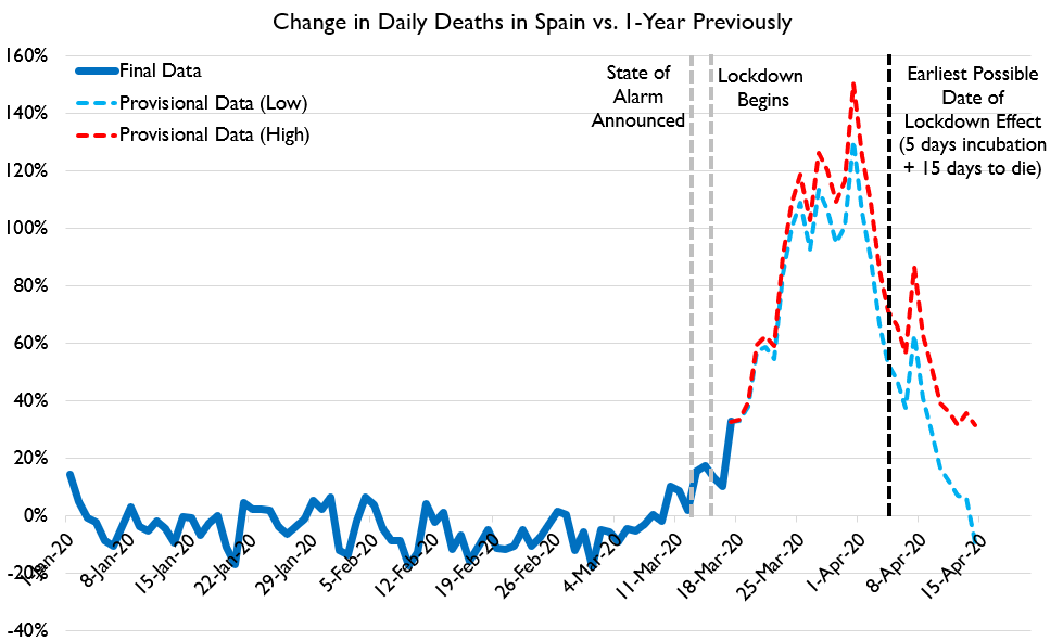
There are various reasons advanced for this argument in the paper.  Here I am only going to focus on one: Stone claims that the average time from illness onset to death for Covid-19 is well established, and that it is 20 days.  When you look at the change in death rates that occurred in many countries after establishing serious lock-down measures, however, you will see that death rates often leveled off sometime around 10 days after the more serious measures were taken.  It is impossible for the slowdown in deaths to have been caused by the lockdowns, argues Stone, because decreases in infection rates can only show up in the death counts a minimum of 20 days later.

How does Stone come up with this 20 day limit?  20 days is the average incubation time for Covid-19 (well-established at about 5 days), plus the average time from onset-of-symptoms till death, which Stone says is 15 days.

Stone's argument that lockdowns could not have caused the decrease in deaths we are seeing is summarized in the following graphic:


(original image here: https://www.thepublicdiscourse.com/wp-content/uploads/2020/04/Fig_1.png)

Why an Average Isn't Appropriate Here

To see what's wrong with Stone's argument, you need to understand what can be concealed by a simple average.  Obviously, just because the average time to die after infection is somewhere around 20 days, that doesn't mean death happens exactly 20 days after infection.  There will be some range of timelines here: some people will die more quickly than average and some people will die more slowly than average.  If enough people die more quickly than the average, then perhaps you would expect to see an effect on the death rates.  The question then becomes, given the average timeline reported by Stone is correct, how many people would need to die faster than average in order for the lockdowns to cause the death rate changes we see at these earlier dates?

Stone does seem to give some amount of thought to this.  He links to several studies on death rates from Covid-19 and he does say that there are a range of days-to-death numbers, which he says is "twelve to twenty-four" days.  With the addition of the days for incubation (which he says is 2-10), this still makes it impossible for the lockdowns to be having an effect on the death rates as early as 10 days

But Stone's claim of a range of "twelve to twenty-four" days is incorrect.

What is the Actual Distribution of Days-to-Death?

Stone linked to several studies to support his claim of a 12-24 day onset-of-symptoms-to-death number.  I think his range must be something like an amalgamation of the averages from these several studies, because none of the studies actually present a range of days-to-death that match the claim.  For example, here is the distribution of days-to-death after onset of symptoms from one of the studies done on the Chinese data:


The article is here: https://www.thelancet.com/journals/laninf/article/PIIS1473-3099(20)30243-7/fulltext .   I produced the graph from the raw data, which is available here: https://github.com/mrc-ide/COVID19_CFR_submission .  I've also created a hand-entered range of probabilities as a data series that matches this distribution (for reasons I'll get into later) which looks like this:


You can see that the range of possible days-to-death here is far wider than Stone initially reported.  They go from as short a time as 5 days to as long as 41 days.  Furthermore, the data is clearly asymmetrical: it is heavily weighted to the left-hand side.  There is a very clear peak at 11 and 12 days and then a "long tail" with some people lingering on for many days before succumbing.  This pattern holds up pretty well in subsequent studies.

This same study produced a corrected probability curve from the data it collected, which I've reproduced as a series:


This distribution is shifted slightly to the right compared to the raw data, which the authors explain as a correction for the timing of the data collection.  The original distribution was weighted to the earlier deaths because it represented a sample taken when the epidemic was still in progress, thus cutting off deaths that occurred on a longer time frame.  This is an important point I'll return to later.

For now, it should be noticed that although the peak of this curve is right around the 15-16 day mark (which sort of agrees with Stone's chosen average number), it still has a leftward trend and it still covers a much wider range of possibilities than the "12-24" range Stone was proposing.

However, this curve does have a peak right around 15 days, and in fact its average is even longer than 15 days: it's 17.8 days rather than 15, because the long tail on the right has a disproportionate effect on the average.  So if the curve has an average of greater than 15 days, and it has a clear peak at around 15 days, isn't it safe to take these 15 days, plus 5 for the incubation time period, as a minimum time before you should expect to see a clear change in the death rates chart?  Certainly it doesn't seem as if you should see much of an effect by just 10 days, as only about 15% of all deaths in this distribution happen at 10 days after symptoms begin or earlier and only 2% of all deaths happen at 5 days or earlier (recalling that incubation itself is an average of 5 days).

Getting an Answer from a Model

There are deterministic ways to calculate how a curve of the above sort should impact a death rate chart.  Those involve some difficult math, however, and it's easy to make mistakes doing that (at least, it is for me).  Another way to get the same answer is to use an epidemic model.  Now, modeling is something about which a lot of people have expressed a great deal of doubt and distrust.  I think there is a lot of misunderstanding about where models are appropriate and where they are not, and when they can be trusted and when they cannot, so this is a good opportunity to discuss how models can be used well.

Here, an epidemic simulation model can be very useful because we have a very specific question we want to ask: is it possible that we could see noticeable changes to the daily death graph as early as 10 days or so, with a disease incubation of 2-8 days (average of 5) and a days-to-death distribution that matches the observed, corrected distribution for Covid-19: that is, with an average of 17.8 days-to-death and a slight bias to lower values and a long tail?  If we applied these parameters to a SIR-based epidemic simulation and we saw only a 10 day delay between the start of some intervention and a clear signal on the graph, then this would disprove Stone's argument.    He claims that it is not possible for an intervention to produce noticeable results on the daily death graph so soon because the average days-to-death is too far in the future.  The existence of a system, even artificial, in which such an intervention does produce a noticeable result in that short time period would be proof against this, because even if the artificial system does not represent reality in many ways, we can construct it in such a way that Stone's point about average days-to-death would affect it just as much as it would affect a real system.

Please notice the very careful way I constructed the previous sentence. It is very crucial, when using model systems, to understand in what ways they represent reality and in what ways they don't--otherwise, the results of a model output can be over-interpreted.  In this particular case, it is very easy to construct a reasonable model in which if Stone's argument about average days-to-death being too long were true, the model would also be affected.  I did so, and the details of the model are as follows:

Details of the Model

I first generated a standard SIR model using a Python package called "Epydemic".  This particular model starts with a random network of individuals with a range of connectedness designed to approximate the mix of more sociable and less sociable members of actual society.  Then it starts with a certain seed of infected individuals and stochastically advances the disease across the network.  Uninfected Individuals connected to infected individuals have a certain chance to become infected every day and infected individuals will become removed from the infection pool at a certain fixed rate.

I took the standard code and then modified it to produce a death rate chart.  I took the corrected days-to-death distribution curve and used it as an input: any time an individual became infected, I would randomly select a days-till-death for that individual based on the probabilities of that distribution curve (for those individuals that I selected to die based off of a set Infection Fatality Ratio).  The actual date of death was calculated for each individual who died as the date of infection plus a certain number of days for incubation (randomly selected from a symmetrical bell-curve distribution with an average of 5 days), plus a certain number of days chosen from the days-till-death distribution curve.  The average days from infection till death was therefore 23.8.

Then I coded in two interventions that I could trigger: a lesser intervention on day 17 of the epidemic and a more severe one on day 20.  These interventions would reduce the percent chance for individual infections to spread, and then I should be able to see what effect that had on the daily death rates, and how quickly these effects were noticeable.

Results

I ran this for a population of 50,000 (chosen for practical reasons of computational speed) first with no intervention and got a fairly standard epidemic curve for an uncontrolled, highly infectious disease:


Notice that you can see how the deaths trail off more slowly than they ramp up, which I think is due to the "long tail" of the days-to-death probability distribution.

Then I applied an intervention which lowered the probability of infection for any given individual on the graph.  I started with a small intervention on day 17 of epidemic which reduced the percent chance of infection by 1/3.  This is the equivalent of an intervention that changes the R from something like 3 to something closer to 2, and it was intended to model the hypothetical situation in which early, less-than-lockdown measures taken did not have the capability to drastically flatten the curve on their own.  This produced this output:


Lowering the infection rate by 1/3rd had a noticeable impact on the total deaths but is hard to pinpoint on the graph, which is as expected.

Then I added a more drastic intervention on day 20, so that from that point on, new infections were cut by a total of 80%, the equivalent of lowering the R to about 0.6.  Note that this intervention only effected numbers of infections.  It could only affect the death rate chart after the delay of incubation plus days-to-death had been met.  In order to also see what happened if the interventions were removed, I turned off the infection suppression at day 50.  The results were as follows:


Even though the average days from infection until death was 23.8 days for this simulation, the timeline for dramatic changes being clearly noticeable on the chart is far less.  Both when beginning interventions and in ending interventions, results were clearly noticeable within about 10 days of the major intervention.  The exact boundaries are obscured because the simulation is stochastic and therefore has lots of random spikes and dips, but I ran the simulation a number of times and got fairly consistent results back.  (Sorry, I didn't save results from multiple runs to create an average of runs with ranges.)


Why Does This Happen?


The obvious question now is, why?  How is it that a clear effect can be seen so far before the average time-to-death is reached?  To explain this, recall the correction to the days-to-death distribution that had to be made earlier.  The actual distribution of deaths measured in the study from which my curve was derived was even further biased to the left and looked like this:


This matches the actual distribution of onset-to-death times seen during the epidemic outbreak.  While the outbreak is going on, not everyone who will die from the infection has yet died from the infection, which means faster deaths make up a disproportionate amount of the death curve than slower deaths.  When the distribution is already slightly weighted to the left, this additional skewing factor creates a very clear earlier signal.

I had constructed the above synthetic curve to have exactly the same weighted average value as the corrected curve (17.8 days till death).  To be honest, this was done as a mistake because I initially thought I should be replicating the observed days-to-death distribution from the study rather than using the timeline corrected version.  But since I had created this distribution and it had the same average value as the correct one, I decided to do some runs with that distribution to see what would happen.  I saw a very clear earlier signal in the graphs produced by these simulations, by about 3-5 days.  Here's an example which shows a very clear result by day 27 or so:

This shows quite conclusively that it is the shape of the distribution, and not just its average, that has a definite effect on how soon you can see results from an intervention.  

Conclusion: How Long Should We Wait to Evaluate an Intervention?

At this point I want to reiterate what I said earlier about models: we should be careful of what conclusions we allow ourselves to draw from their output.  Because we have created synthetic situations in which interventions have a clear effect within 10 days of their introduction, even though the average time between infection and death is set to 23.8 days, we have definitively disproven Stone's argument that these interventions can not be responsible for death rate changes.  But to say that we now know that the expected time between an intervention and a change in death rates is 10 days would be to overstate the results of these models.  We don't know how well this simple model actually maps to reality.  I think that the results are highly suggestive of a 10 day lag between policy change and visible results, but that's as far as we should take this conclusion.

The lesson that you should not do your calculations simply from averages, though, is absolutely clear and it represents a major mistake in Stone's original thought.

Postscript: Stone's Correction

After I began this post, Stone was corrected on his use of a simple average by a statistician named Cheianov, and produced a backup-argument that even if you model an expected peak in deaths due to lockdowns being very effective, the peaks in death rates in the real world were still off of the model slightly, by about three days.  His new argument is here: https://twitter.com/lymanstoneky/status/1253304661475385345

To this I would respond two things:
  1. Quibbling over three days is unwise when there are many factors that could have a confounding effect on how accurate the models are.  In particular, this whole conversation so far has been assuming a days-to-death distribution established by some of the earliest published studies--which in turn were all constructed using data from China.  We know that Western countries have a significantly larger portion of vulnerable elderly than China does; it's quite possible that these people die more rapidly than natively healthier people.  This alone could be responsible for a left-ward bias in specifically Western death rates; we don't know.  So I think Stone's new conclusion is very weak.
  2. In Stone's corrected argument, he models the "lockdowns are what's effective" hypothesis with a curve that represents only the effect of the lockdown.  In my simulations, I modeled a 3-day-earlier, not-very-effective-measure followed rapidly by a much more effective measure.  I think my approach is the more fair, since no one is claiming that only the lockdowns had any effect, just that they were the definitive change; Stone's corrected argument is therefore a mathematical strawman.  Furthermore, I did test out my models with and without that earlier 3 day intervention and it did make a noticeable difference, so this isn't just a quibble.
Overall, though, I would like to concede an important point: it is not abundantly clear from the data I've been looking at here that the lockdowns specifically must be responsible for taming infection rates.  In reality, there is too little time between when most nations started implementing lesser measures and when they changed course and opted for strict lockdowns.  The real-world data has too much variability and confounding factors to be able to differentiate yet which set of measures or which societal responses (Stone's social distancing metrics from Google, for example) had the most effect.  To illustrate this, I ran my simulation one more time with the intervention on day 17 decreasing the infection rates by a full 70% and the intervention on day 20 only bumping that up by an extra 10%.  The end result was not easy to distinguish, at all, from any of my previous runs:

This means that none of us should be too confident in our causal conclusions yet.

[EDIT: 5/11/2020]

I realized a couple of things after I posted this originally.  First, I should really provide a link for the code I'm using to create these graphs.  It's here: https://github.com/cshunk/EpydemicTest .  Warning: not pretty, though it is also quite simple.

Second, I realized that in explaining how the graph of daily deaths is biased at different times in the epidemic to earlier deaths, the obvious thing to do would have been to track what the average days-to-death was for every day in the epidemic.  I did that for a run and the result is as follows.  The orange series is what the average days-to-death was over every death that happened on that particular day:

You can see how the average days-to-death is lower earlier in the epidemic, and also drops after interventions are stopped and the disease is progressing exponentially again.  This is because as long as the number of deaths are rising quickly, recently infected people are always a larger group than less recently infected people, meaning that earlier deaths from the recently infected will still be larger than later deaths from less recently infected, even though the percentages are still small.


Friday, May 1, 2020

Understanding the Relationship between R, Herd Immunity, and Attack Rate

The end goal for dealing with Covid-19 is either complete elimination (unlikely at this point) or "herd immunity", which is the state wherein enough people are immune to the disease (either through already having had it or through a vaccine) so that the disease can no longer easily spread through the population.

How many people need to be immune in order for us to achieve herd immunity?  This is an important question for policy decisions because--given that some relatively fixed percentage of people who get the disease will die*--the answer to this question will also answer the question of how many people will need to die if you want to achieve herd immunity to a disease without having a vaccine.

It turns out that the number of people you need to achieve herd immunity is directly related to the speed at which the virus naturally propagates through your population: the basic reproduction number, or the now-infamous "R".  This can actually be shown to be the case with a little bit of thought and not much math.

Setup for the Thought Experiment

R is simply defined as the number of people that one infected person, on average, will pass the disease to for the complete time during which he is infected. Now this average number will obviously depend on two things: how naturally infectious the disease is, and how many occasions an average person in a society will have the opportunity to infect some other person.

In the middle of a pandemic, which many societal measures in place to prevent the spread of the disease and with many people voluntarily altering their behaviors so that they don't spread the disease, R is going to depend on a lot of situationally specific factors: what are the local societal restrictions, how compliant the public is with them, how have people changed their behavior due to the disease, etc.  

However, if we're talking about herd immunity, we can kind of ignore those factors, because what we are trying to get at is the percentage of the population who need to be immune in order for the disease to die away without artificially imposed behavioral changes.  In other words, what we want to know is, when can life go back to normal without fear of infection?

Infection Spread in Normal Societal Conditions

So for our purposes now, we can assume normal societal mixing in our thought experiment as a constant.  The number of people who will be infected by a single infected case, or R, is then going to depend only on how infectious the disease is, and not on abnormal societal factors.

Now, as we said, R is a value that combines the factors of how naturally infectious the disease is and how much social mixing an infected person will do during the course of the disease.  You can think of this as multiplying two numbers:  an infected person will come into close enough contact with a certain number of people during the course of the infection, and each time will have a certain percent chance to infect that person.  Multiply those two numbers and that's the total number of people whom that person will infect.  

So if an average person in a society comes into close contact with 100 people during the course of his illness and has a 2% chance of infecting someone each time, he will on average infect 2 people in total and the R of the disease will therefore be 2.

How Immunity Changes the Picture

What if, in the same scenario above, an infected person comes into contact with 100 people, but 10% of those people have already had the illness and are now immune?  Well, in that case that same 2% chance of each person getting infected will only apply to 90 out of the 100 people the infected person meets.  So that means that the R is going to drop down to 1.8.  Another way of saying this is that the baseline R of the disease (the R(0) or "R naught") needs to be multiplied by the fraction of the population that is susceptible to the disease (0.9 in our example) in order to get the current effective R value.

Now it's obvious that in order for a disease to grow in a population, R must be higher than 1.  If it's less than 1, it will begin decreasing in the population.  It can still spread if R is less than 1, but it cannot grow.  That is, if there are 1000 infected people in your population and the R is 0.7, 700 additional people will be infected in the next disease "generation", and then 490, and so on and so forth.  But as long as the R is less than 1, the disease will be progressively dying and not growing. And this is what you want from herd immunity.

**Therefore, the point at which you can claim herd immunity is exactly the point at which the fraction of people who are still susceptible to the disease would multiply with the R(0) of the disease to equal 1.**

So for measles, which has a ferocious R(0) of about 10, you would need a very low 10% of your population to be susceptible in order to reduce the R to 1, which means that you don't get herd immunity until 90% of the population is immune.  Seasonal flu, on the other hand has an R(0) of something like 1.3.  1/1.3 is around 0.77, so you can get herd immunity against the current seasonal flu with just 23% of the population already having been infected (or otherwise immunized).

Covid-19 has a very high R relative to the flu.  Estimates started at around 2.4, but have gone up with better analysis and is probably closer to 3.8.  Supposing it is 3.8, what percentage of population would need to be infected in order to confer herd immunity? 1/3.8 is about 0.26, so that means the answer is about 74% of the population.

Relationship to Attack Rate

The "attack rate" of a disease is the total percent of the population that will get the disease before it runs its course.  From a policy standpoint, it would be good to know what this number will be if we pursue achieving herd immunity via letting the infection run its course.

This total number of infected is not equivalent to the percentage of the population required to be immune in order to achieve herd immunity.  This is because even when you achieve this number--if you achieve it by letting people get infected--at that time you still have a certain percentage of people infected with the disease, and (as we said) the disease will still spread from those infected people at ever decreasing rates as it is dying out.

You can actually calculate the likely number of people who are still going to get the disease in this situation, but this is not so simple as what we have done so far: it requires differential calculus, and I said there wasn't going to be much math.  So I'll skip that part and just say: there will be some further infections after herd immunity is reached, if it is reached by lots of people getting infected.

Conclusion

Reaching herd immunity is not the same for every disease.  The number of people who need to be immune in order for herd immunity to work depends on the native infectiousness of the disease.  Because Covid-19 is quite a bit more infectious than the seasonal flu, we need to understand that getting to herd immunity with Covid-19 involves a far larger percentage of the population getting sick than is typical for a bad flu season, around 75% at a bare minimum.

-------
* Note: I said above that the number of people who will die from the disease is a relatively fixed proportion of the total attack rate.  I should acknowledge that this is not a completely safe assumption, given that various treatments could be developed or discovered that would make Covid-19 less fatal.


Monday, April 20, 2020

Problems with the New Antibody Study from Santa Clara

I've been watching for results from various SARS-CoV-2 antibody testing projects with great interest, so I was interested to know that a Santa Clara County antibody survey just published interim results, here: https://www.medrxiv.org/…/10…/2020.04.14.20062463v1.full.pdf
I was extremely annoyed, however, on reading the results to find out that they recruited for their study using a Facebook ad! This makes their study population essentially self-selected and hence, in my view, practically worthless. I have no idea, either, how you would go about trying to correct for this self-selection bias.
The paper they cited as justification for this practice largely touted Facebook as a "cost effective" way of getting a mostly representative study population--which might be true if you're researching something for which the specific population whose size you are trying to gauge didn't have a vested interest in participating in your study in order to get a very hard-to-obtain and very sought after test. So yeah . . . "cost effective" except that they just wasted over 3000 perfectly good antibody tests on a study with a massive bias problem which we can't realistically quantify or correct for.

More Detailed Criticism

Imagine you are someone who had flu like symptoms a month or a few weeks ago. Now, like everyone in the world, you're wondering, "gee, was that really Covid-19? I bet I had Covid-19 and didn't even know it!" So if you see an ad on Facebook for a "hey, participate in this antibody testing study!", you are highly motivated to say "me! me! me! yes, test me!". On the other hand, if you have not had any flu like symptoms in the past two months, you are only motivated to take the study (which involves getting in your car and driving somewhere to get your blood drawn) if you understand the public health importance of figuring out how many asymptomatic cases there are. Which some people do, but a lot of people don't.

So by the design of the study, the population they are actually studying is probably much more representative of people in Santa Clara County who have had flu or cold symptoms recently than it is of people in Santa Clara County in general. And then of course you are going to way over-sample people who actually did have Covid-19 compared to the rest of the population. The claimed "50 to 85 times as many people" number is meaningless because of this oversampling.

Now, I admit, with something as high profile as Covid-19 antibody testing, it'll be hard to completely eliminate the self-selection bias--but it's not impossible. First of all, I would not use a Facebook ad campaign to recruit volunteers. I would use start with a home survey sent to a randomized set of addresses (as Dr. Streeck did in his antibody testing in the Gengelt). And I would not say in the survey that it was specifically for antibody testing, just that it was a study on Covid-19. 

Then I would follow up with an explanation: "OK, so now we would like to do antibody testing on you", and I would explain the importance to public health of getting as high of a participation rate as possible--really sell it hard and try to get everyone you selected to participate. This takes advantage of the existing attention capture, because it's a lot easier to get people to go along with something they've already partially bought into. And I really don't think it would be hard to get very high participation rates from a truly random sample if you approached it this way.

Can Self-Selection Bias be Corrected For?

If you start a study with a survey of a pre-selected set of randomized addresses, then you get to report on what percentage of people didn't participate in your survey. Which means you get to quantify the potential self-selection bias: something like, "since 30% of people chose not to take our test, we might have such-and-such percent selection bias."

The only way to do this with a Facebook ad campaign is to report on the total number of people who saw your ad but didn't click on it . . . which is kind of a dubious number given it's really hard to tell with internet ads how many people actually look at them or not. But the study didn't even report how many views the ad campaign got, or even how many people clicked on the ad, just the total number of people who filled out the initial online survey. So they're not even trying to quantify the massive self-selection bias. This is super shoddy, in my opinion.

How Bad Could the Effect of the Bias Be?

I did some simple calculations in a Google spreadsheet to try to quantify how bad a self-selection bias could be: https://docs.google.com/spreadsheets/d/1JfYxfak6uY4Bd1vBA-HGOYn_OECfGvrIp-H2ygPqn5M/edit?usp=sharing
The goal was to figure out how many different infection rates could actually match the results the Santa Clara study obtained. My question was this:

This study was reporting an interim result of an infection fatality rate for Santa Clara county of 0.12-0.2%. How big an effect would self-selection have to be in order for the true IFR to be actually 1%?

For this, you first have to decide on a percentage of people in Santa Clara county who might think, "hey, I might have had Covid-19 in the past two months". I first set this percentage at 20%, which I think is very generous considering the estimated total percentage of the population who gets the flu for the whole flu season is only 10%--I'm sort of adding in some people who had cold symptoms as well. It's a guestimate, let's go with it.

When you have this percentage, then you can start playing with a multiplier that represent how much more likely it is that people in that specific group of the population (people who have reason to suspect they might have had Covid) would respond to the Facebook ad campaign compared with people who have no reason to think they might have had Covid. The spreadsheet will then tell you how many people you would expect would test positive for Covid from the study under those assumptions. You then need to adjust your numbers till it matches the number of people from the study that actually tested positive for Covid (50), and that will tell you what the self-selecting bias needs to have been.

In order to achieve a target IFR of 1% (around 10 times the study number), and assuming that a full 20% of all people in Santa Clara had reason to believe they had Covid for some reason (again, I feel that very generous), then I need these people to be 4.6 times more likely to respond to the Facebook ad than people who have no reason to suspect they had Covid. I think it's entirely reasonable to think that people who think they might have had Covid would be up to 5 times more likely to respond to such a survey.

If I decrease my 20% estimate and say instead that just 5% of all people in Santa Clara had some reason to think they had Covid earlier, then I only need these people to be 2.9 times more likely to respond to the Facebook ad in order to get the 50 positive tests the study obtained.

Interestingly, after going through this exercise, I think this does open up a way that the self-selection bias could be a least partially detected. The study took a survey of the respondents, and I assume they asked some basic questions including whether they had any cold or flu symptoms in the past few months--although the preliminary report does not say that they took this sort of survey information, so maybe I'm assuming too much. But assuming they did, they could compare the percentage of respondents reporting previous symptoms with the percentage of the general population who actually had undiagnosed flu-like illnesses. This should track with a self-selection bias, I think.

Postscript

After I went through my own analysis, I discovered that a peer reviewer of this study has come to some similar conclusions: https://medium.com/@balajis/peer-review-of-covid-19-antibody-seroprevalence-in-santa-clara-county-california-1f6382258c25.  He doesn't do a sensitivity analysis of the same sort that I do, but he does also have a different concern based off of the false positive percentage of the test used as well.  The review is worth reading.

Thursday, April 16, 2020

Explaining Shifting Covid-19 Fatality Rates

People have been confused about the wide estimates of the fatality of Covid-19.  At one point, the WHO issued an estimate to the effect that 3.8% of people infected by Covid-19 would die.  At one point, it looked like Italy was having more than a 10% fatality rate.  Later, we've heard a lot of people say something to the effect that Covid-19 is "10 times deadlier than the flu", which works out to be something like a 1% fatality rate.  Quite recently, a preliminary report on a serological antibody survey in Germany stated that the true fatality rate in this region works out to be only 0.37%

So why do we see these shifting, very different death estimates?  Why is this hard to pin down?  The number we are trying to establish here is the Case Fatality Rate, or CFR, and it's defined very simply as the number of deaths from a disease divided by the total number of people who have that disease: if 100 people get a disease and 10 of them die, that's a CFR of 10%.  The math is a simple division, so what makes this hard to determine?

It turns out that there are two primary sources of uncertainty in calculating a CFR:

  • Uncertainty in knowing how many people actually have the disease (the denominator of the percent).
  • A timeline specific uncertainty in knowing how many deaths will occur (the numerator of the percent) that happens if you are trying to calculate a CFR in the middle of an epidemic. 

I wanted to try to illustrate both of these problems with estimating the fatality rate for a new disease, so I came up with some scenarios and graphs that demonstrate them.  You can look at all the numbers I came up with for this scenario on this google spreadsheet: https://docs.google.com/spreadsheets/d/1ePV5OnN5xeHYmXyzxbpccYUrxPnffTeU6_YtFOYmiLU/edit?usp=sharing

The Disease Timeline


The first thing I did was to generate some numbers in a spreadsheet for an infection in a location that behaves roughly as we have seen Covid-19 behave.  My model for the infection curve that I generated was roughly South Korea, as it has the most complete data for a rise-and-fall of the disease so far.  I generated about 3 1/2 months of infections-per-day numbers that rise exponentially for the first 30 days, then abruptly level off due to interventions, and then decay rather rapidly after a time.  Then I assumed that some percentage of people with the disease would require hospitalization (10% is the amount I chose), but that on average, people wouldn't need hospitalization until they'd been infected for 10 days.  Then I assumed that some percentage of people who were hospitalized (again, 10% is what I chose) would die, on an average of 7 days after hospitalization.  This gives a total real-life CFR of 1%.  It also give us three graphs which show the same curve shape, but scaled down and shifted in time for the hospitalizations and again for the deaths.


(The curve shapes are pretty terrible because I don't know how to do logistic curves in Google Spreadsheets, but this is fine to get the point across.)

What is the Apparent CFR?


With this timeline established, I then asked the question: given this disease progression timeline, what would the CFR appear to be at any given moment?  At any moment, if the people in this scenario stopped to tally up all the deaths that had occurred so far and divide that by all the infections they knew about, what would they think the CFR was?

And the answer to this is, it depends on what infections they know about.

So let's look at three different scenarios:

  1. Poor knowledge of infections
  2. Consistently good knowledge of infections
  3. Perfect knowledge of infections.
In all three scenarios, we are going to assume that we know about all infections that become hospitalized, so these people always get counted in with the known infected.  How many non-hospitalized infected are known is what varies for each scenario.

In the first scenario, we are going to assume that our sample nation was unprepared and did almost no testing in the general population until some amount of people started dying: call this the "Italian Paradigm".  Even after testing starts, it ramps up slowly, only reaching full capacity by the end of the outbreak. 

Furthermore, we are going to assume that there is a large body of infected people who have no symptoms and who never get tested--say, half of all the infected people.  So in the "poor knowledge" scenario, the testing for non-hospitalized cases starts near zero and only goes up to a bit above 40% of total coverage at the best.

In the second scenario, we are going to assume that the sample nation was prepared and jumped on testing right away: call this the "South Korean" paradigm.  Here we are going to assume a constant high rate of testing that catches most symptomatic infected people.  However, we are still going to assume a large body of infected people who are asymptomatic who never get tested.  So for this scenario, we are saying that 45% of all infected people outside of the hospital system are known about, as well as all the people within it.

In the third scenario, we are going to assume that we somehow magically know all of the infected people right away.

I generated the numbers of known infected people per day given these knowledge restrictions, for each scenario.  Then a calculated what the apparent CFR would look like if it was calculated each day by taking the sum of deaths so far and dividing it by the sum of these known infected.  Here's what I got:

Poor Knowledge of non-Hospital Infections


What we see here is that due to the lack of good knowledge of how many non-hospitalized infections there are, the apparent CFR almost immediately jumps up to an artificially high number.  Given no extra-hospital testing, this would eventually rise to 10%, which is the fatality rate I chose for infections that get to the hospitalization stage.  Once some testing starts to kick in, though, the number starts to go down, as knowledge of total infected starts to get better.  However, while this does happen, more people continue to die, and this effect starts taking over and the apparent CFR starts rising again.  It finally rests at a number 6 times what it should be, which indicates that while all deaths are counted by the end, only 1/6th of the total infected were ever counted.

I am also plotting on this chart (for comparison purposes) the third scenario, where we magically know all infections at all time: this is the red line on the graph.  Note that even with perfect knowledge, due to the time lag of when people die, this also gives an incorrect apparent CFR up until the very end.

Consistently Good Knowledge of non-Hospital Infections


Here we see that due to prompt testing, we don't see an initial spike of the apparent CFR to unrealistic levels dominated by the death rate in hospitals.  Instead, though, we see an initial underestimation of CFR, and this is due to the time lag in deaths.  This, in my opinion, matches very well with the evolution of CFR that we saw in places like South Korea and Germany, where there was an initial very low CFR estimate that has been creeping up over time.  I think both places had pretty good testing in place before the epidemic began to take off (South Korea more so than Germany, but I think both did pretty well).

This is an important context in order to understand the 0.37% CFR that Dr. Streeck recently reported.  It needs to be understood that this number would correspond to a point on the red line on this graph: a point at which all deaths so far are known, and also all infections (statistically in this case due to a serological study).  If you look at where Germany as a whole is on the curve at the time Dr. Streeck reported his conclusion, I think you will see that it matches in this scenario at a point in time a little past the 1/3rd mark--the point shortly after interventions are starting to flatten the curve.

This means we should not be surprised to see the CFR in Germany increase over time above Dr. Streeck's preliminary report.  Doubling or even tripling would not surprise me.

Conclusion

Attempting to evaluate the CFR of a disease while it is in mid-progression is fraught with problems.  I have demonstrated only two of the problems with this very over-simplified model.  Therefore, the best projections of disease fatality do not use this kind of simplistic logic.  If you want to see the more sophisticated way in which these things are done, I encourage you to look at the disease severity study which the Imperial College study used, which I discussed in this blog post earlier: https://darkenedintellect.blogspot.com/2020/03/the-imperial-college-study-part-3a.html .

Monday, April 13, 2020

Are the lockdowns responsible for declines in infection growth?

Recently, infection and death rates in Europe and the United States appear to be leveling off and even dropping.  Since this was the point of the massive social distancing measures the whole industrialized world has been taking, the natural interpretation of this would be: the measures we took are working and we are beginning to see the results.

However, some people have claimed that the leveling off of deaths is not due to strict isolation measures, but something the disease was going to do anyway.  What we are seeing, this theory claims, is a natural peak in the disease.  Lockdown measures may have slightly reduced the total number of deaths, but the behavior of the curve was going to follow the current path we are seeing anyway, more or less.  The clear implication of this theory, if it is correct, is that we should end the strict social distancing measures and the disease will dwindle away on its own.

Can we determine which interpretation of the facts fits best?  I think we can, fairly simply.

What the Prevailing Theory Expects

Given the theory that the disease will act in the standard way in which one expects an epidemic to act, what we should see is that the infection grows exponentially at first, but then rapidly shifts its growth rates after social distancing measures are put into place, in every place in which these measures are enacted.  We can visualize this infection curve using an online pandemic calculator, available here: http://gabgoh.github.io/COVID/index.html

To model our scenario, I have put in a disease with an R(0) of 3.  This is midway between earlier estimates of Covid-19's R(0), which was around 2.4, with later estimates which have put it as high as 3.87.  Then I set an intervention date about a month into the course of the disease which has the effect of reducing the R(0) to around 1: the threshold below which a disease will begin to die out.  Here's what that looked like:


Note that the resulting curve is composed of two curves, which I've marked in red and in blue.  On the left of the intervention, there is a standard exponential curve, concave up.  Right at the point of the intervention, it rapidly switches to concave down.  It still rises for a bit, but it has a shallow hump which then trails off gradually afterwards.

The exact shape of the right-hand side of the curve depends a lot on what you set the R(0) to be after the intervention.  Depending on how effective your intervention strategy is, the daily infections can die off either rather steeply, or rather slowly.  I've heard, for example, an estimation of current, post-lockdown R(0) being put at 0.62.  This is what the pandemic calculator looks like with that number instead:


I encourage my readers to go to this site and play around with the numbers yourself--if nothing else, this should cause you to have better sympathy for the shifting numbers coming from the IHME projections, because you will quickly see that small changes to the R(0) (which is the degree to which people are spreading the virus around) can have quite large changes to the final infected number.

What's Actually Happening

So now let's look at reality instead of this model.  Do we see this same sort of results in those countries that have had significant outbreaks, and then initiated strict societal interventions in order to flatten the curve?

In order to look at this, we'll pick some countries from the Worldometer site.  In order not to have our results confused by poor testing (which has been a problem in many countries), we are going to look at daily death rates rather than daily infection rates.  This curve should be the same shape as the daily infected curve, just smaller and with some time lag, since only a fraction of infected will die and since it takes time for people to progress from having the infection to dying.

Here is Spain's daily death chart:

You can see clearly the exponential growth on the left side and a clear, abrupt transition to a smoothly curved peak and gradual decay on the right.  The date of the transition appears to be somewhere around March 24th.


Here's Italy's chart:


Again, we can clearly see exponential growth on the left abruptly transitioning to a shallow hump and gradual decline to the right.

What about Germany?  In this case, the shape is less clear:
In this case, the exponential growth on the left is obvious, but it's not so obvious what's happening on the right.  Here we should realize that Germany's curve starts later than Spain's and Italy's.  The pandemic apparently reached Germany later than it did Italy and Spain, so we're not seeing the peak and trail-off yet in the death rates.  However, let's cheat with Germany and look at the daily infection rates chart--we should be able to see the effects of lockdown earlier with these numbers because of the time lag between infection and death.  Germany has been doing a lot better in testing than a lot of other countries, so maybe we can trust that their infection rate numbers are fairly reliable:

Nice!  It actually looks just like a continued form of the deaths chart from above.  More evidence, I think, that Germany's testing has been far more representative of actual infection rates than other countries' has been.

What about South Korea?  Here we have a problem that South Korea has been so on top of the pandemic, from the very beginning, that their daily death rate chart doesn't have enough data to form a recognizable curve: they just haven't had enough people die.  This is excellent, but it does mean we can't use their chart for this analysis.  However, since their epidemic control has been driven by extensive testing, we can probably do what we did for Germany and use their daily infection rates, again probably with a good degree of confidence:


OK, the smaller dataset does make the curve more patchy, but it still fits pretty well: concave up on the left and a trail-off on the right.  It does appear to me that the drop-off on the right for South Korea is more dramatic than the trail-offs we've been seeing in Europe.  This would fit with their lower overall death rate, though: the fact is, South Korea has simply had a better handle on the epidemic from the beginning.

So lastly, how is the United States doing?  First, it should be pointed out that, as opposed to all of the countries we've listed so far, the United States hasn't had one set of lockdown measures.  Different states implemented different lockdown measures at different time.  We should expect to see a bit of overlapping curve flattening from the time periods when different states were probably experiencing different disease growth rates.  Second, the United States is clearly behind Italy and Spain in the pandemic timeline, so we're likely to have small amounts of data for the right side of the curve.  Those caveats being given, here's what we see:

Fits pretty well, I'd say, given the caveats above.  Given the massive testing problems the U.S. had early on, I'm reluctant to use the daily infection rate curve, but given that our testing has been better recently, maybe we can get a better sense at least of what the right side of the curve looks like?

Still unclear, I'd say; we're still too early on.  However, it certainly doesn't invalidate the theory; I'd say it weakly confirms it.

Timeline of the Inflection Points

Now that we've seen that the shape of the curves we see in real life are matching quite well with the predicted curves for the standard theory, can we also ask the question, does the timing of the curve flattening correspond with the lockdowns?  Different countries imposed societal lockdowns at different times; if they are what is responsible for the curve flattening, we should expect to see some correlation in the timelines.

For the nations that we have looked at so far, here is a table showing the dates for which those countries imposed a nation-wide lockdown (or in South Korea's case, a nation-wide banning of large public gatherings), side-by-side with the dates at which I am seeing an inflection curve in their charts:

Lockdown ImposedDate of Inflection
South Korea  Feb. 21stFeb. 27th (for infections)
ItalyMarch 9thMarch 19th
SpainMarch 14thMarch 24th
GermanyMarch 22ndApril 2nd
United States  March 22nd (New York)        ~April 4th

To me, this timeline is compelling; I don't see how anyone could look at this data and not conclude that we are seeing the results of societal changes in the infection and death rates at this point.

The Alternative Theory: The Disease is Peaking by Itself

However, let's suppose the above is not found to be convincing.  What about the alternative theory?  What would we expect to see if the disease is playing itself out, without social distancing being a major factor in the decline of the disease? 

You can see what a standard epidemic disease curve looks like by using the epidemic calculator (making the intervention meaningless by setting the post-intervention R(0) to the same as the pre-intervention R(0)):


Notice that the left and right hand sides of the curve are symmetrical: it declines as rapidly as it attacks, once the population has been saturated.  This shape does show up in real-life as well; we see this sort of shape in uncontrolled epidemics all the time.  Here's an example graph from some '70s measles outbreaks, for example:

This outbreak came in a rapid sequence of waves (measles is *extremely* infectious), which had a roughly symmetrical look to them.  Here's another example which is a collection of epidemic curves from the SARS outbreak:

https://www.who.int/csr/sars/epicurve/epiindex/en/

Here I notice that the right hand side of the curve in these charts is typically as steep to decline or steeper than is the left hand attack portion of the curve.

I find the lack of "spikiness" of the real data we are seeing difficult to square with how epidemics of very infectious diseases look like.  I don't know how proponents of this theory explain an exponential attack and a much less exponential decay.

Total Infection Counts

The real problem with this theory, though, is the total infection counts, as a percentage of the population.  If the real factor in limiting the continued growth of the disease were that it was reaching inherent limits of the population and herd immunity were kicking in, then each nation should see roughly the same total percentage of their population infected by the end.  Herd immunity works by a certain percentage of the population becoming immune, thus crippling the disease's ability to spread rapidly.

So what sort of total infection percentages are we looking at here?

South Korea has a population of 52 million people.  They have had 217 deaths so far, and their curve is completely flattened.  That's a total death rate of 0.0004% of the population.

Italy has a population of about 60 million people.  They're not done with their curve yet, but they've had 20,000 deaths so far . . . maybe we'll guess 25,000 deaths before the curve fully flattens.  That's a total death rate of 0.042% of the population.  That's over 100 times as many people as a percentage of their population than South Korea.

Spain has a population of about 47 million people.  They're also not done with their curve yet, but they look on track to total maybe about 20,000 deaths.  That's a total death rate of 0.043% . . . very similar to Italy's.

Germany has a population of about 83 million people.  They're even further behind in the timeline than Spain and Italy, but with only 3000 deaths so far, maybe we can project a full doubling and say 6000 total deaths by the time of curve flattening.  That's a total death rate of 0.0072% of the population.  This is less than 1/5th of the total numbers Italy and Spain are going towards, but more than 15 times the number South Korea is going to end up with.

The United States has a population of about 327 million people.  Again, we're back in the timeline a bit too far to project accurately, but applying the same logic as I did with Germany, we'd end up with a total of around 45,000 deaths  (I know 60,000 or so is the current best estimate, but I'm just trying to be consistent with what I did for Germany).  This would work out to a total death rate of 0.014%, which would put us somewhere in between Germany on the one hand and Spain and Italy on the other hand for total percentage infected.

These numbers are all impossible to explain by the theory that the disease is simply spreading naturally and hitting its natural peak due to herd immunity building in all the countries of the world in which it is spreading.  Why should South Korea hit that natural peak 100 times faster than Italy did?  Why should Germany hit that peak 15 times faster than Italy but only twice as fast as the United States?

Conclusion

The conclusion here is quite clear: Covid-19 is currently being limited by drastic social distancing measures (in the case of most of the world) or a combination of early testing and case management plus less drastic social distancing measures (in the case of South Korea and some others).  There is no way for naturally acquired herd immunity to explain the current decrease in rates of infection and death that we are seeing, but it is easy to explain this using the standard, accepted theory of the disease spread.  The highly different percentages of the total population that will die is therefore strictly due to the difference in promptness which these different nations implemented effective disease control measures.

Tuesday, March 31, 2020

The Imperial College Study: Part 3B

[Links to the full series]

Part 1
Part 2
Part 3A
Part 3B

------------


1. How were the CFR and IFR calculated for the Imperial College study?


Since the Imperial College study is a microsimulation, it was simulating a whole population and hence needed to use an IFR, not a CFR. It got an IFR from this study: https://www.medrxiv.org/conte…/10.1101/2020.03.09.20033357v1

Let's look at how this study came up with their numbers:

The report estimated the CFR and IFR based on three different datasets and using multiple techniques in order to validate the results. They looked at data from mainland China (70,000+ cases as of February 11th, then cross checked with latest results as of March 3rd), data from the Diamond Princess cases, and data from cases being tracked outside China (about 2000 cases as of February 25th).

My description of their techniques is going to be very much an oversimplification because I find it hard to describe the statistical techniques employed in a short space. Here's my understanding of some of the key features of the technique used for the mainland China data:

  1. They broke the population into 10 year age bands and assumed that covid-19 would attack each age band equally.
  2. They took the actual age demographics of the infected areas and projected how many people should get sick in each age band.
  3. The looked at how many people were diagnosed as sick in each age band. For the younger age bands, this was fewer than projected given an equal attack rate. This gave them an age-band-specific underreporting amount.
  4. Most of the fatalities were in Wuhan, but Wuhan had a much higher fatality per reported case than mainland China. They assumed this was due to hospital overcrowding causing milder cases to get turned away, so they added in a further factor representing hospital overloading to scale down the Wuhan numbers to be in line with the rest of the Chinese numbers.
  5. For each age-band, they then identified which CFR that--given the onset-to-death times which were observed--would have produced the observed total cumulative deaths as of the most recent data, given the underreporting factors that they identified.
  6. They then aggregated these age-band specific CFRs into a population-wide CFR, which turned out to be 1.38%. Note, though, that this number is specific to the Chinese age demographics.

To estimate an IFR from this CFR, they used data from people repatriated out of China back to their homelands. All of these people were tested, and it was discovered that there were about as many asymptomatic people who tested positive as there were symptomatic people who tested positive. This led to the final IFR for the Chinese outbreak being estimated at 0.66%. I should note here, though, that the data sample size here was particularly small: a total of 6 asymptomatic people who tested positive from those flights.

To validate their IFR using the Diamond Princess data, they took a timeline of onset-of-symptoms for the 705 diagnosed passengers on the cruise. Then applying their age-specific onset-to-death results on the actual ages of the diagnosed passengers, they projected that by March 5th, between 3 and 14 people should have died if their IFR was correct. Since 7 passengers had died by that date, the Diamond Princess case was judged to be consistent with their results.

To separately estimate a CFR from all of cases outside China, they used two different methods, neither of which I have looked into enough to understand. At the time this study was done, this was a pretty small sample size (1334 cases out of 2000+ met their inclusion standards). Also, they didn't have individual-level onset-of-symptom or recovery data for a lot of those cases. For these two reasons, the CFR estimates cover a wide range, from 0.4% to 7.2%, with 1.2% being the best fit to the data. This basically validated the reasonableness of the 1.38% result from mainland China.

2. That's a lot of information. What's the bottom line for the Imperial College study again?


What the Imperial College study took from all of the above is that the Covid-19 IFR is about 0.66% for Chinese demographics. They also took the age-specific IFR from the study and applied it to the older Great Britain demographics to get an IFR that they used for their simulations of 0.9%. They also used the onset-to-death time periods and the percentage of hospitalizations from that study (which I didn't get into here but was another thing calculated from the same data).