A researcher Lyman Stone has written a paper (here:
https://www.thepublicdiscourse.com/2020/04/62572/) claiming to prove, by various means, that lockdowns don't work. Specifically, it claims that while various social measures taken to limit Covid-19 may have been successful in limiting the spread of the disease, the more extreme measures such as generalized stay-at-home orders have
not been what have done the trick.
There are various reasons advanced for this argument in the paper. Here I am only going to focus on one: Stone claims that the average time from illness onset to death for Covid-19 is well established, and that it is 20 days. When you look at the change in death rates that occurred in many countries after establishing serious lock-down measures, however, you will see that death rates often leveled off sometime around 10 days after the more serious measures were taken. It is impossible for the slowdown in deaths to have been caused by the lockdowns, argues Stone, because decreases in infection rates can only show up in the death counts a minimum of 20 days later.
How does Stone come up with this 20 day limit? 20 days is the average incubation time for Covid-19 (well-established at about 5 days), plus the average time from onset-of-symptoms till death, which Stone says is 15 days.
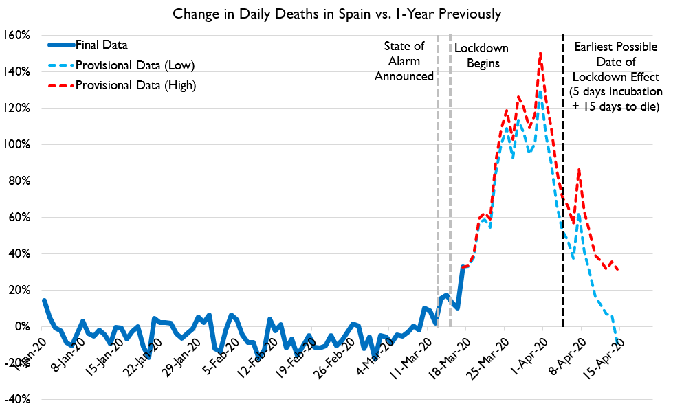
Stone's argument that lockdowns could not have caused the decrease in deaths we are seeing is summarized in the following graphic:
(original image here:
https://www.thepublicdiscourse.com/wp-content/uploads/2020/04/Fig_1.png)
Why an Average Isn't Appropriate Here
To see what's wrong with Stone's argument, you need to understand what can be concealed by a simple average. Obviously, just because the average time to die after infection is somewhere around 20 days, that doesn't mean death happens exactly 20 days after infection. There will be some range of timelines here: some people will die more quickly than average and some people will die more slowly than average. If enough people die more quickly than the average, then perhaps you would expect to see an effect on the death rates. The question then becomes, given the average timeline reported by Stone is correct, how many people would need to die faster than average in order for the lockdowns to cause the death rate changes we see at these earlier dates?
Stone does seem to give some amount of thought to this. He links to several studies on death rates from Covid-19 and he does say that there are a range of days-to-death numbers, which he says is "twelve to twenty-four" days. With the addition of the days for incubation (which he says is 2-10), this still makes it impossible for the lockdowns to be having an effect on the death rates as early as 10 days
But Stone's claim of a range of "twelve to twenty-four" days is incorrect.
What is the Actual Distribution of Days-to-Death?
Stone linked to several studies to support his claim of a 12-24 day onset-of-symptoms-to-death number. I think his range must be something like an amalgamation of the averages from these several studies, because none of the studies actually present a range of days-to-death that match the claim. For example, here is the distribution of days-to-death after onset of symptoms from one of the studies done on the Chinese data:

You can see that the range of possible days-to-death here is far wider than Stone initially reported. They go from as short a time as 5 days to as long as 41 days. Furthermore, the data is clearly asymmetrical: it is heavily weighted to the left-hand side. There is a very clear peak at 11 and 12 days and then a "long tail" with some people lingering on for many days before succumbing. This pattern holds up pretty well in subsequent studies.
This same study produced a corrected probability curve from the data it collected, which I've reproduced as a series:
This distribution is shifted slightly to the right compared to the raw data, which the authors explain as a correction for the timing of the data collection. The original distribution was weighted to the earlier deaths because it represented a sample taken when the epidemic was still in progress, thus cutting off deaths that occurred on a longer time frame. This is an important point I'll return to later.
For now, it should be noticed that although the peak of this curve is right around the 15-16 day mark (which sort of agrees with Stone's chosen average number), it still has a leftward trend and it still covers a much wider range of possibilities than the "12-24" range Stone was proposing.
However, this curve does have a peak right around 15 days, and in fact its average is even longer than 15 days: it's 17.8 days rather than 15, because the long tail on the right has a disproportionate effect on the average. So if the curve has an average of
greater than 15 days, and it has a clear peak at around 15 days, isn't it safe to take these 15 days, plus 5 for the incubation time period, as a minimum time before you should expect to see a
clear change in the death rates chart? Certainly it doesn't seem as if you should see much of an effect by just 10 days, as only about 15% of all deaths in this distribution happen at 10 days after symptoms begin or earlier and only 2% of all deaths happen at 5 days or earlier (recalling that incubation itself is an average of 5 days).
Getting an Answer from a Model
There are deterministic ways to calculate how a curve of the above sort should impact a death rate chart. Those involve some difficult math, however, and it's easy to make mistakes doing that (at least, it is for me). Another way to get the same answer is to use an epidemic model. Now, modeling is something about which a lot of people have expressed a great deal of doubt and distrust. I think there is a lot of misunderstanding about where models are appropriate and where they are not, and when they can be trusted and when they cannot, so this is a good opportunity to discuss how models can be used well.
Here, an epidemic simulation model can be very useful because we have a very specific question we want to ask: is it possible that we could see noticeable changes to the daily death graph as early as 10 days or so, with a disease incubation of 2-8 days (average of 5) and a days-to-death distribution that matches the observed, corrected distribution for Covid-19: that is, with an average of 17.8 days-to-death and a slight bias to lower values and a long tail? If we applied these parameters to a SIR-based epidemic simulation and we saw only a 10 day delay between the start of some intervention and a clear signal on the graph, then this would disprove Stone's argument. He claims that it is not possible for an intervention to produce noticeable results on the daily death graph so soon because the average days-to-death is too far in the future. The existence of a system, even artificial, in which such an intervention does produce a noticeable result in that short time period would be proof against this, because even if the artificial system does not represent reality in many ways, we can construct it in such a way that Stone's point about average days-to-death would affect it just as much as it would affect a real system.
Please notice the very careful way I constructed the previous sentence. It is very crucial, when using model systems, to understand in what ways they represent reality and in what ways they don't--otherwise, the results of a model output can be over-interpreted. In this particular case, it is very easy to construct a reasonable model in which if Stone's argument about average days-to-death being too long were true, the model would also be affected. I did so, and the details of the model are as follows:
Details of the Model
I first generated a standard SIR model using a Python package called "Epydemic". This particular model starts with a random network of individuals with a range of connectedness designed to approximate the mix of more sociable and less sociable members of actual society. Then it starts with a certain seed of infected individuals and stochastically advances the disease across the network. Uninfected Individuals connected to infected individuals have a certain chance to become infected every day and infected individuals will become removed from the infection pool at a certain fixed rate.
I took the standard code and then modified it to produce a death rate chart. I took the corrected days-to-death distribution curve and used it as an input: any time an individual became infected, I would randomly select a days-till-death for that individual based on the probabilities of that distribution curve (for those individuals that I selected to die based off of a set Infection Fatality Ratio). The actual date of death was calculated for each individual who died as the date of infection plus a certain number of days for incubation (randomly selected from a symmetrical bell-curve distribution with an average of 5 days), plus a certain number of days chosen from the days-till-death distribution curve. The average days from infection till death was therefore 23.8.
Then I coded in two interventions that I could trigger: a lesser intervention on day 17 of the epidemic and a more severe one on day 20. These interventions would reduce the percent chance for individual infections to spread, and then I should be able to see what effect that had on the daily death rates, and how quickly these effects were noticeable.
Results
I ran this for a population of 50,000 (chosen for practical reasons of computational speed) first with no intervention and got a fairly standard epidemic curve for an uncontrolled, highly infectious disease:
Notice that you can see how the deaths trail off more slowly than they ramp up, which I think is due to the "long tail" of the days-to-death probability distribution.
Then I applied an intervention which lowered the probability of infection for any given individual on the graph. I started with a small intervention on day 17 of epidemic which reduced the percent chance of infection by 1/3. This is the equivalent of an intervention that changes the R from something like 3 to something closer to 2, and it was intended to model the hypothetical situation in which early, less-than-lockdown measures taken did not have the capability to drastically flatten the curve on their own. This produced this output:
Lowering the infection rate by 1/3rd had a noticeable impact on the total deaths but is hard to pinpoint on the graph, which is as expected.
Then I added a more drastic intervention on day 20, so that from that point on, new infections were cut by a total of 80%, the equivalent of lowering the R to about 0.6. Note that this intervention only effected numbers of infections. It could only affect the death rate chart after the delay of incubation plus days-to-death had been met. In order to also see what happened if the interventions were removed, I turned off the infection suppression at day 50. The results were as follows:

Even though the average days from infection until death was 23.8 days for this simulation, the timeline for dramatic changes being clearly noticeable on the chart is far less. Both when beginning interventions and in ending interventions, results were clearly noticeable within about 10 days of the major intervention. The exact boundaries are obscured because the simulation is stochastic and therefore has lots of random spikes and dips, but I ran the simulation a number of times and got fairly consistent results back. (Sorry, I didn't save results from multiple runs to create an average of runs with ranges.)
Why Does This Happen?
The obvious question now is, why? How is it that a clear effect can be seen so far before the average time-to-death is reached? To explain this, recall the correction to the days-to-death distribution that had to be made earlier. The actual distribution of deaths measured in the study from which my curve was derived was even further biased to the left and looked like this:

This matches the actual distribution of onset-to-death times seen during the epidemic outbreak. While the outbreak is going on, not everyone who will die from the infection has yet died from the infection, which means faster deaths make up a disproportionate amount of the death curve than slower deaths. When the distribution is already slightly weighted to the left, this additional skewing factor creates a very clear earlier signal.
I had constructed the above synthetic curve to have exactly the same weighted average value as the corrected curve (17.8 days till death). To be honest, this was done as a mistake because I initially thought I should be replicating the observed days-to-death distribution from the study rather than using the timeline corrected version. But since I had created this distribution and it had the same average value as the correct one, I decided to do some runs with that distribution to see what would happen. I saw a very clear earlier signal in the graphs produced by these simulations, by about 3-5 days. Here's an example which shows a very clear result by day 27 or so:

This shows quite conclusively that it is the shape of the distribution, and not just its average, that has a definite effect on how soon you can see results from an intervention.
Conclusion: How Long Should We Wait to Evaluate an Intervention?
At this point I want to reiterate what I said earlier about models: we should be careful of what conclusions we allow ourselves to draw from their output. Because we have created synthetic situations in which interventions have a clear effect within 10 days of their introduction, even though the average time between infection and death is set to 23.8 days, we have definitively disproven Stone's argument that these interventions can not be responsible for death rate changes. But to say that we now know that the expected time between an intervention and a change in death rates is 10 days would be to overstate the results of these models. We don't know how well this simple model actually maps to reality. I think that the results are highly suggestive of a 10 day lag between policy change and visible results, but that's as far as we should take this conclusion.
The lesson that you should not do your calculations simply from averages, though, is absolutely clear and it represents a major mistake in Stone's original thought.
Postscript: Stone's Correction
After I began this post, Stone was corrected on his use of a simple average by a statistician named Cheianov, and produced a backup-argument that even if you model an expected peak in deaths due to lockdowns being very effective, the peaks in death rates in the real world were still off of the model slightly, by about three days. His new argument is here:
https://twitter.com/lymanstoneky/status/1253304661475385345
To this I would respond two things:
- Quibbling over three days is unwise when there are many factors that could have a confounding effect on how accurate the models are. In particular, this whole conversation so far has been assuming a days-to-death distribution established by some of the earliest published studies--which in turn were all constructed using data from China. We know that Western countries have a significantly larger portion of vulnerable elderly than China does; it's quite possible that these people die more rapidly than natively healthier people. This alone could be responsible for a left-ward bias in specifically Western death rates; we don't know. So I think Stone's new conclusion is very weak.
- In Stone's corrected argument, he models the "lockdowns are what's effective" hypothesis with a curve that represents only the effect of the lockdown. In my simulations, I modeled a 3-day-earlier, not-very-effective-measure followed rapidly by a much more effective measure. I think my approach is the more fair, since no one is claiming that only the lockdowns had any effect, just that they were the definitive change; Stone's corrected argument is therefore a mathematical strawman. Furthermore, I did test out my models with and without that earlier 3 day intervention and it did make a noticeable difference, so this isn't just a quibble.
Overall, though, I would like to concede an important point: it is not abundantly clear from the data I've been looking at here that the lockdowns specifically must be responsible for taming infection rates. In reality, there is too little time between when most nations started implementing lesser measures and when they changed course and opted for strict lockdowns. The real-world data has too much variability and confounding factors to be able to differentiate yet which set of measures or which societal responses (Stone's social distancing metrics from Google, for example) had the most effect. To illustrate this, I ran my simulation one more time with the intervention on day 17 decreasing the infection rates by a full 70% and the intervention on day 20 only bumping that up by an extra 10%. The end result was not easy to distinguish, at all, from any of my previous runs:
This means that none of us should be too confident in our causal conclusions yet.
[EDIT: 5/11/2020]
I realized a couple of things after I posted this originally. First, I should really provide a link for the code I'm using to create these graphs. It's here:
https://github.com/cshunk/EpydemicTest . Warning: not pretty, though it is also quite simple.
Second, I realized that in explaining how the graph of daily deaths is biased at different times in the epidemic to earlier deaths, the obvious thing to do would have been to track what the average days-to-death was for every day in the epidemic. I did that for a run and the result is as follows. The orange series is what the average days-to-death was over every death that happened on that particular day:
You can see how the average days-to-death is lower earlier in the epidemic, and also drops after interventions are stopped and the disease is progressing exponentially again. This is because as long as the number of deaths are rising quickly, recently infected people are always a larger group than less recently infected people, meaning that earlier deaths from the recently infected will still be larger than later deaths from less recently infected, even though the percentages are still small.


